The modern approach on responsive design
Posted on
Internationalization:
Logical properties
Instead of writing margin-left, using margin-inline-start to refers to the margin on the left side of a content box in a left-to-right language, and the margin on the right side of a content box in a right-to-left language.
There are more logical properties that can be explored further at web.dev
tips about internationalization:
When you're designing websites that will be translated into other languages and writing modes, think about these factors:
Some languages, like German, have long words in common usage. Your interface needs to adapt to these words so avoid designing narrow columns. You can also use CSS to introduce hyphens.
Make sure your line-height values can accommodate characters like accents and other diacritics. Lines of text that look fine in English might overlap in a different language.
if you're using a web font, make sure it has a range of characters broad enough to cover the languages you'll be translating into.
Don't create images that have text in them. If you do, you'll have to create separate images for each language. Instead, separate the text and the image, and use CSS to overlay the text on the image.
My thoughts on logical properties: it's worth learning and adapting to use logical properties instead of directional properties since it's more resilient to different languages shown on your web page, for example, Arabic and Hebrew read from right to left, and some Japanese typefaces read vertically instead of horizontally.
Typography
Clamping text
You probably don't want your text to shrink and grow to extremes. You can control where the scaling starts and ends using the CSS clamp() function. This “clamps” the scaling to a specific range.
The clamp() function is like the calc() function but it takes three values. The middle value is the same as what you pass to calc(). The opening value specifies the minimum size, in this case, 1rem so as to not go below the user's preferred font size. The closing value specifies the maximum size.
html {
  font-size: clamp(1rem, 0.75rem + 1.5vw, 2rem);
}
Font loading
Use the CSS font-display property to tell the browser how to manage the switchover from a system font to a web font. You could choose to show no text at all until the web font is loaded. You could choose to display the system font immediately and then switch over to the web font once it loads. Both strategies have their downsides. If you wait until the web font is downloaded before showing any text, users may find themselves staring at a blank page for a frustratingly long time. If you show the text in a system font first and then switch over to the web font, users may experience a jarring shifting of content on the page.
You can mitigate the jarring effect of text shifting around by using size-adjust in your @font-face rule.
A good compromise is to wait for a short while before displaying any text. If the web font loads before that time is up, the text is displayed using the web font with no content shifts. If the web font still hasn't loaded after the time is up, the text is displayed using the system font so at least the user can read the content.
Use a font-display value of swap if you still want the web font to replace the system font whenever the web font finally loads.
body {
  font-family: Roboto, sans-serif;
  font-display: swap;
}
My thoughts on font loading: using font-display: swap to change the font, and combining with size-adjust to mitigate the jarring effect
Further reading
Responsive Image
CSS properties to achieve a great responsive image:
img {
  max-inline-size: 100%;
  block-size: auto; // means that the aspect ratio of the images will remain constant.
  aspect-ratio: 2/1; // (optional) If your design calls for an image to have an aspect ratio that's different from the image's real dimensions, use the aspect-ratio property in CSS
  object-fit: cover; // An object-fit value of cover tells the browser to preserve the image's aspect ratio, even if that means cropping the image at the top and bottom.
  object-position: top center; // If the cropping at the top and bottom evenly is an issue, use the object-position CSS property to adjust the focus of the crop. You can make sure the most important image content is still visible.
}
Setting width & height on an image tag
Even if the image is rendered at a different size (because of your max-inline-size: 100% rule), the browser still knows the width to height ratio and can set aside the right amount of space. This will stop your other content from jumping around when the image loads.
Use the loading attribute to tell the browser how urgently you want it to load an image. For images below the fold, use a value of lazy. The browser won't load lazy images until the user has scrolled far down enough that the image is about to come into view. If the user never scrolls, the image never loads.
There's also a decoding attribute you can add to img elements. You can tell the browser that the image can be decoded asynchronously. The browser can then prioritize processing other content.
<img
  src="image.png"
  alt="A description of the image."
  width="300"
  height="200"
  loading="lazy"
  decoding="async"
>
Use the background-image property in CSS to load presentational images
less ideal:
If you embed an image that is purely a visual flourish without any meaningful content, use an empty alt attribute.
You must still include the alt attribute. A missing alt attribute is not the same as an empty alt attribute. An empty alt attribute conveys to a screen reader that this image is presentational.
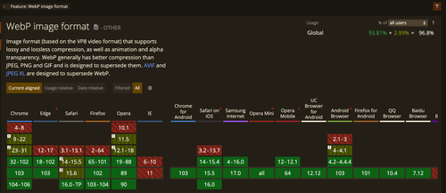
Image format:
use WebP, main reason: saving around 25% or more on the image size for the same image quality. AVIF has a better compression rate, but has very limited browser support.
On the other hand, WebP has more than 96% usage on global users, only IE and safari on macOS Catalina oe before doesn't support it.
Theming
You'll want to use CSS custom properties to store your color values. It can be useful in places like dark mode. Check the theming page in web.dev for more detailed information
Carousels
Best practice on carousels